Turn OLAP data into Geo Charts
instantOLAP contains a flexible GEO chart engine which allows to present your OLAP data as colorful maps with custom texts, color codings, icons and other visualizations in multiple layers.
[youtube uw-4UDKpTyA 600 400]
This (video) tutorial shows how to create GEO charts, starting with a simple background layer. Watch the video or continue reading to learn more about maps in instantOLAP.
[toc]
instantOLAP 3
This tutorial uses the beta version of instantOLAP 3. Creating Geo Charts with instantOLAP 2.6 works exactly the same way, you’ll only need to design your report with the instantOLAP Workbench, because the web query editor is a new feature of version 3.
Shapefiles
The OLAP System uses standard ESRI Shapefiles for the maps. Because the ESRI Shapefile format is very common, nearly every kind of map is available. Various shapefiles can be found for free in the internet or purchased. The instantOLAP default installation contains the free „world_countries_shp“ shapefile with the world countries borders, which will be used for this example.
Create a geo chart block
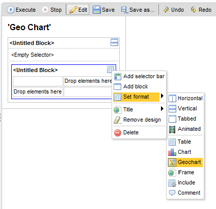
First of all, you will have to create a new block inside your report and change its format into the „Geo Chart“ format. After you did this, a number of new properties will appear for this block.
Layers
Maps in instantOLAP are organized in background and foreground layers. Each kind of layer can be displayed as polygons, texts or symbols.
Adding background layers
The background layers will always be rendered, independend of the table data or anything else. You can use the background layers to display the fixed background information you need for your report, e.g. country borders and country names.
Adding a first polygon background layer
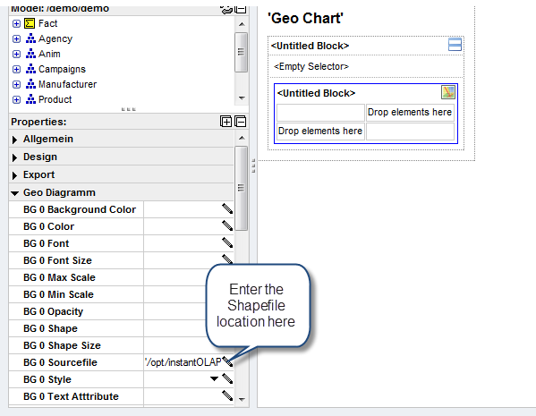
First of all, we will a add a simple background layer to the chart. Simply tell the system where to find the shapefile on the hard disk by filling the property „BG 0 Sourcefile“. Fill in the absolute path here, because shapefiles don’t need to be located inside the instantOLAP repository. Also, if your background and frontend server are located on different machines, this path should be visible for the frontend server.
For this example, the path would be „<instantOLAP>/repository/geodata/World_countries_shp.shp“ – whereby <instantOLAP> is the installation path of your instantOLAP server.
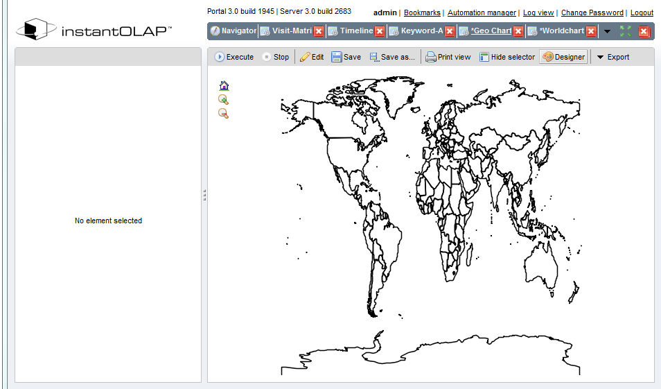
After you located the shapefile, it’s time for a test. Execute the report and you should see your first map inside instantOLAP. It displays the world country borders as black borders with empty polygons.
Now you can change some properties of the background layer to change its presentation, e.g. by assigning colors to the properties „BG 0 Background“ and „BG 0 Color“ (which is the border color).
Adding a text layer
Now we’ll display the country names in a second background layer. Shapefiles can contain additional informations for each polygon which are stored in a simple DBase database (located in the same folder as the Shapefile itself). There are a number of tools you may use to open and view/edit this database files, including Microsoft Excel.
You max have noticed that additional properties were added to the chart property list after you edited the „BG 0 Sourcefile“ property. The editor automatically adds properties for an additional layer whenever you assign a value to a layer sourcefile and this is the location where to add the second layer.
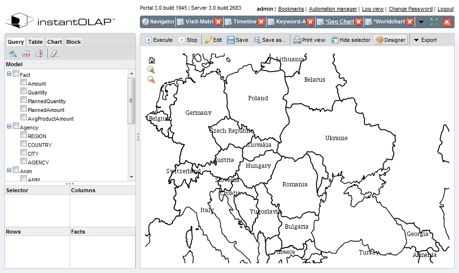
Use the same shapefile for the property „BG 1 Sourcefile“ and set the „BG 1 Type“ property to „Text“ – this will turn the layer into a text layer. Now you must tell the system which database information you want to display as the text. In our example Shapefile, the country names are stored in the column „NAME“ – simply enter this attribute name into the property „BG 1 Text Attribute“.
Adding data layers
Data layers are similar to background layers but they only display the fragments of the Shapefiles related to the table data. E.g. a data layer could highlight single countries in certain colors, dependend on a cube value like the turnaround for that country.
Each row of your OLAP query will be related to a single map fragment. Therefore, a data layer needs additional information to link the fragments to the rows of your query. This is realized by matching the header text of the Y-axis with a text attribute of the Shapefile database. E.g. if your query contains ISO country codes in the Y-headers, there must be a database field in the Shapefile with exactly mathing ISO codes.
Adding a first data layer
Adding a data layer works the same as adding a background layer: Enter the absolute path of the shapefile in the property „Data 0 Sourcefile“ to create a new layer.
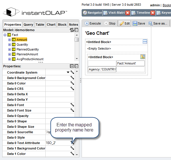
Now you’ll have to match the table with the Shapefile segments: For our example, add a fact (e.g. turnaround) to the X-axis of the table and the level „COUNTRY“ of the agency dimension to the Y-axis. Because the COUNTRY level contains the ISO contry codes as keys and the World_countries_shp Shapefile contains these codes as attribute, we can tell the system how to match the headers to the Shapefile. The Shapefile attribute is named „ISO_2“, therefore you’ll have to enter this name in the attribute „Data 0 Text Attribute“.
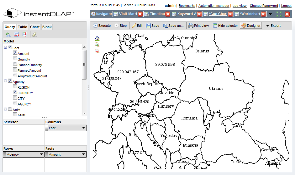
If you execute the report now you’ll see some new numbers in some countries. This is the table content, mapped to the regions identified by the Y-axis headers which are mapped to the Shapefile regions.
Color coding
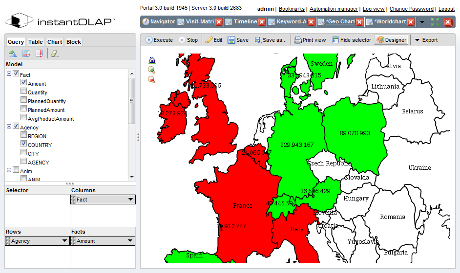
A number of table properties are straight forward displayed in the map, including the background and foreground color of your table cells. Therefore, color coding for maps works the same as for tables – simply change the background color of the Y-axis headers and the polygons in the map will have the same colors as the table would.
In our example, you can add a simple color coding by entering the following expression into the background expression of the Y-Axis header: „IIF( Amount() < 30000000, ‚red‘, ‚green‘ )“. This will turn the background color to „red“ if the turnaround for a country is less than 30 million or to „green“ if not.
Leave a comment